Welcome to ACH AGENCY
We are a full Online creative design studio based in Marrakech. We specialize in Web Development , Marketing & Branding, and Online experiences.


Rebranding
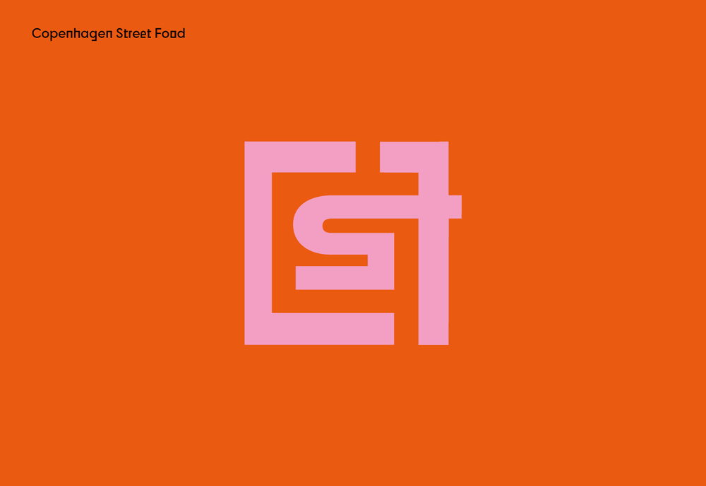
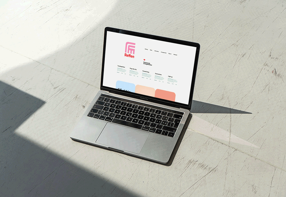
Reffen Street Food Rebranding Case Study (Copenhagen)
CLIENT
Reffen
SERVICES
Rebranding
INDUSTRIES
Restaurant
DATE
April '2021
Reffen is an open-air street-food market and creative hub on Refshaleøen in Copenhagen, celebrating innovation, entrepreneurship, creativity, gastronomy and diversity. as the local scene evolved, the original visual identity—hand-painted signage, inconsistent typography and an ad hoc color palette—no longer reflected Reffen’s dynamic spirit or its status as a destination for both locals and international visitors. leadership saw an opportunity to modernize the brand, making it feel more corporate-friendly while preserving the playful, inclusive essence that drew Copenhagen’s creative and skate communities.
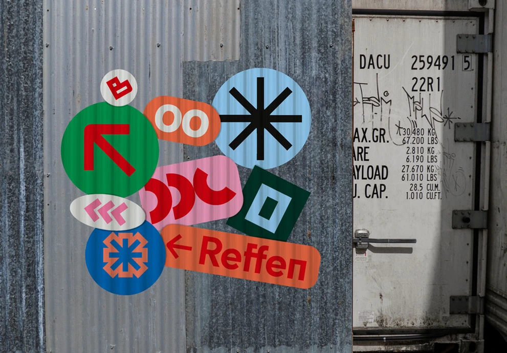
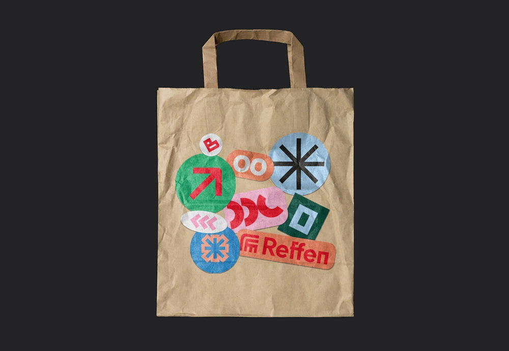
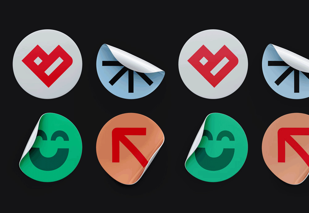
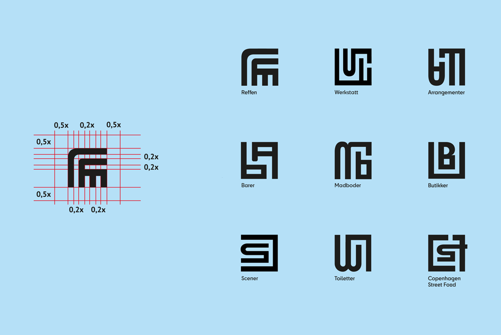
– the rebranding initiative aimed to unify Reffen’s disparate elements—food stalls, artisan workshops, live performances, skate events and design studios—under a cohesive visual system. key objectives included designing a primary logo marque inspired by the industrial waterfront environment, developing a logotype that underscored innovation and inclusivity, and creating wayfinding stickers that were both fun and functional. the ultimate goal was to balance the contrast between masculine and feminine, playfulness and seriousness, ensuring Reffen’s identity would resonate with local foodies, entrepreneurs and potential investors alike.
– one major hurdle was consolidating Reffen’s many subcultures into a single visual framework. the original brand assets varied in style and quality, leading to confusion among vendors, visitors and partners. without a clear identity system, newcomers found it difficult to navigate the sprawling venue, and stakeholders disagreed on how “corporate” the refresh should feel without diluting Reffen’s grassroots charm. achieving consensus required extensive workshops and iterative concept reviews.
– another challenge was capturing Reffen’s constant state of transformation in static assets. seasonal pop-ups, spontaneous skate sessions and rotating art installations defined Reffen’s appeal, but traditional logos and color palettes felt too rigid. the design needed to accommodate large-scale banners on shipping containers, digital promotions on social media, and small-format stickers for wayfinding—all while maintaining consistency and legibility in Copenhagen’s variable weather and lighting conditions. balancing these functional requirements with the desire for a lively, adaptable identity was central to overcoming the challenge.
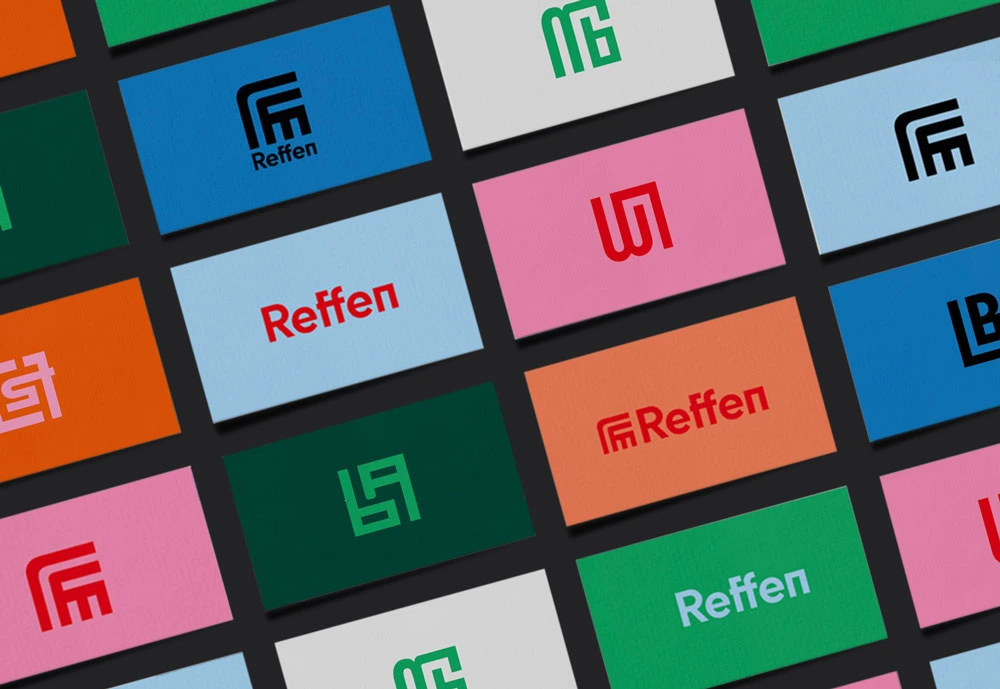
Within weeks of the rebrand launch, foot traffic rose by 20 %, driven by improved wayfinding and social-media teasers with animated logo fragments, and visitors noted that the new signage made exploration more intuitive and encouraged longer stays. local artisans and vendors welcomed the polished identity, which attracted collaborators design students, food entrepreneurs and performance artists while preserving Reffen’s inclusive spirit, and the skate community especially valued the nod to their culture in the sticker icons and angular letterforms. corporate partners and sponsors praised Reffen for maintaining grassroots credibility while appearing more professional, and social-media engagement on posts featuring the new logo increased by 35 %, reflecting broader reach and stronger brand affinity. key takeaways include the importance of embedding local context industrial architecture, skate culture and street art into design to foster authenticity; using a dynamic logo system to allow creative flexibility without diluting the core identity; and balancing playfulness with seriousness by employing a versatile toolkit of shapes, colors and layouts adaptable to varied contexts.