Welcome to ACH AGENCY
We are a full Online creative design studio based in Marrakech. We specialize in Web Development , Marketing & Branding, and Online experiences.


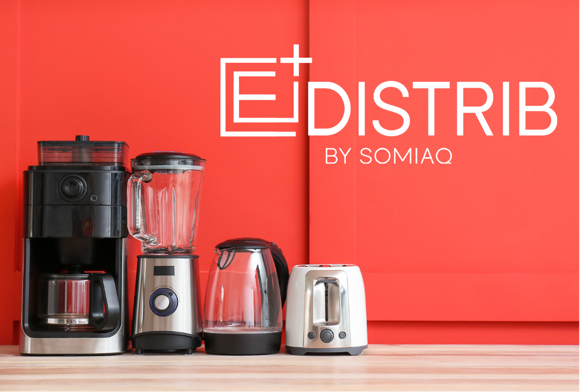
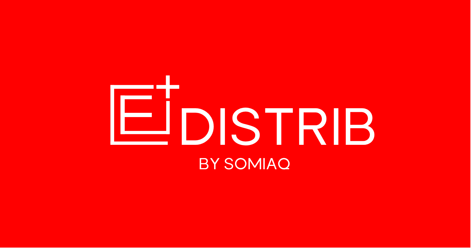
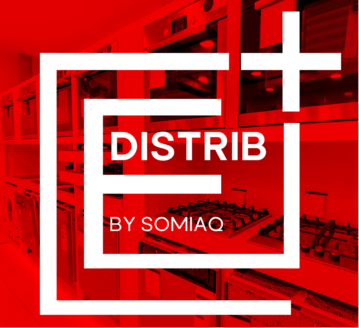
Edistrib by Somiaq — a branding project merging modernity and precision. The goal was to build a clean, trustworthy visual identity for a distribution brand. We developed a strong red and neutral palette symbolizing energy and balance. Typography combined Solen Bold for headers and Selon Regular for readability. The logo was designed in multiple layouts for flexible brand applications. Every element emphasized clarity, professionalism, and visual harmony. We crafted a cohesive system suitable for packaging, print, and digital use. The minimalist aesthetic reflects efficiency and modern logistics values. A bold yet simple identity that communicates reliability and innovation. The result? a timeless brand presence ready for market expansion.